Tiles
Organize the content in tiles of equal width.
The <Tiles> is a layout component which is based on CSS grid system.
Usage
<Tiles> serves as a versatile container, ideal for constructing panels, cards, lists, and other content components that organize and group information. They automatically wraps children to a new line if the space given is not enough to show the <Tiles> in one row.
It's possible to display the items with some spacing through space prop or set a minimum width for all items inside <Tiles> with tilesWidth prop.
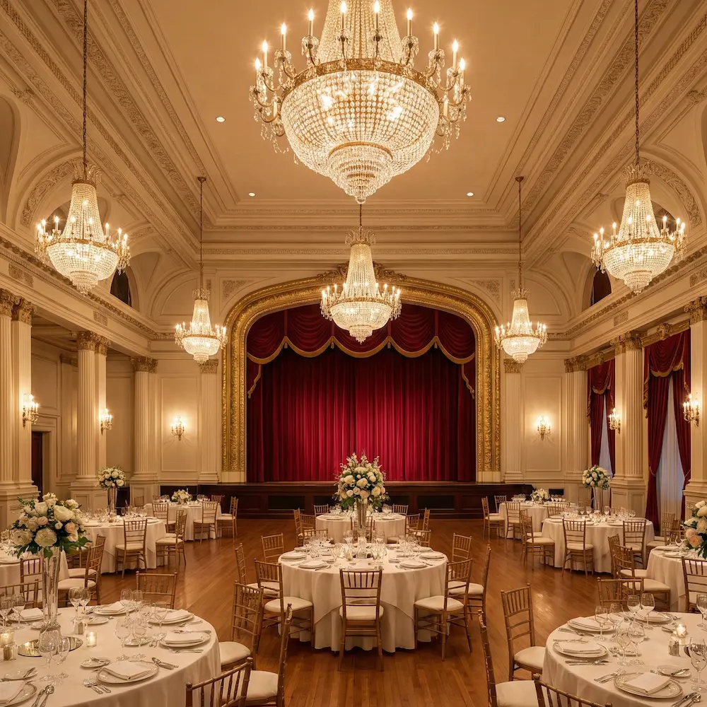
Grand Avenue Ballroom

Maple Court Theatre

Broadway Community Center
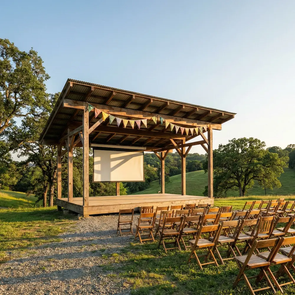
Hillcrest Open Pavilion
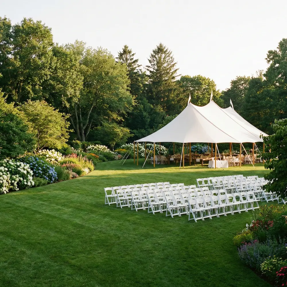
Bloomfield Garden Lawn
Equal heights
If you need to have the items in the <Tiles> take the same height, you can use the equalHeight property, which is a boolean value that can be used to size the items of the <Tiles>. In this case, all items adopt the size of the largest card, making it essential when you want all items to match the largest child's dimensions.
Stretch width
Using the stretch property will make the tiles fully responsive. Meaning, they will distribute available width between them while not getting smaller than the given tilesWidth.
Props
Tiles
Prop
Type
Accessibility props (6)
Prop
Type
Alternative components
Columns: It should be noted that
<Tiles>is used for children with the same width. If you want to set different widths for the children use<Columns>instead.Grid: If you need more custom control over the layout, you should use
<Grid>component instead.