Autocomplete
A searchfield that displays a dynamic list of suggestions.
The <Autocomplete> component is an input field that offers suggestions for the user's input as they type. These proposals are based on a predefined set of options.
It also helps to reduce the effort and time required to input data and to avoid errors that can occur due to typos or misspellings. The suggestions are displayed in a combobox list, and the user can select one of the options or continue typing their own input.
Anatomy
Autocomplete is made up of a form input field, label, and overlay of menu options. The label and description aren't required and may be visually hidden. The clear button is shown after typing starts.
Label: Descriptive text guiding the user on what information is required in the input field.
Input field: A text box where users can enter or edit data.
Help text: Supplementary information displayed below the input field to assist users in filling out the form correctly. Can also be an errormessage.
Clear button: A button that allows users to quickly remove all text from the input field.
Dropdown arrow: An icon indicating that more options are available. Clicking it reveals a list of selectable items.
Overlay: Hold a list of all possible options which can be selected.
Appearance
The appearance of a component can be customized using the variant and size props. These props adjust the visual style and dimensions of the component, available values are based on the active theme.
| Property | Type | Description |
|---|---|---|
variant | - | The available variants of this component. |
size | - | The available sizes of this component. |
Usage
Use an autocomplete search field (also known as a predictive search) to help users find what they're looking for faster. An autocomplete search field displays suggestions as someone types into the field, just like the Google search bar. It is also suitable for fields where people know what they're looking for, e.g. country of birth, a particular event, or a particular city.
Do
<Autocomplete> instead of a long list.Text label
The label of the <Autocomplete> provides a clear and concise description of its purpose, making it easier for users to
interact with the interface and understand it.
Always display a label unless the <Autocomplete> is next to another component which already has a label.
Do
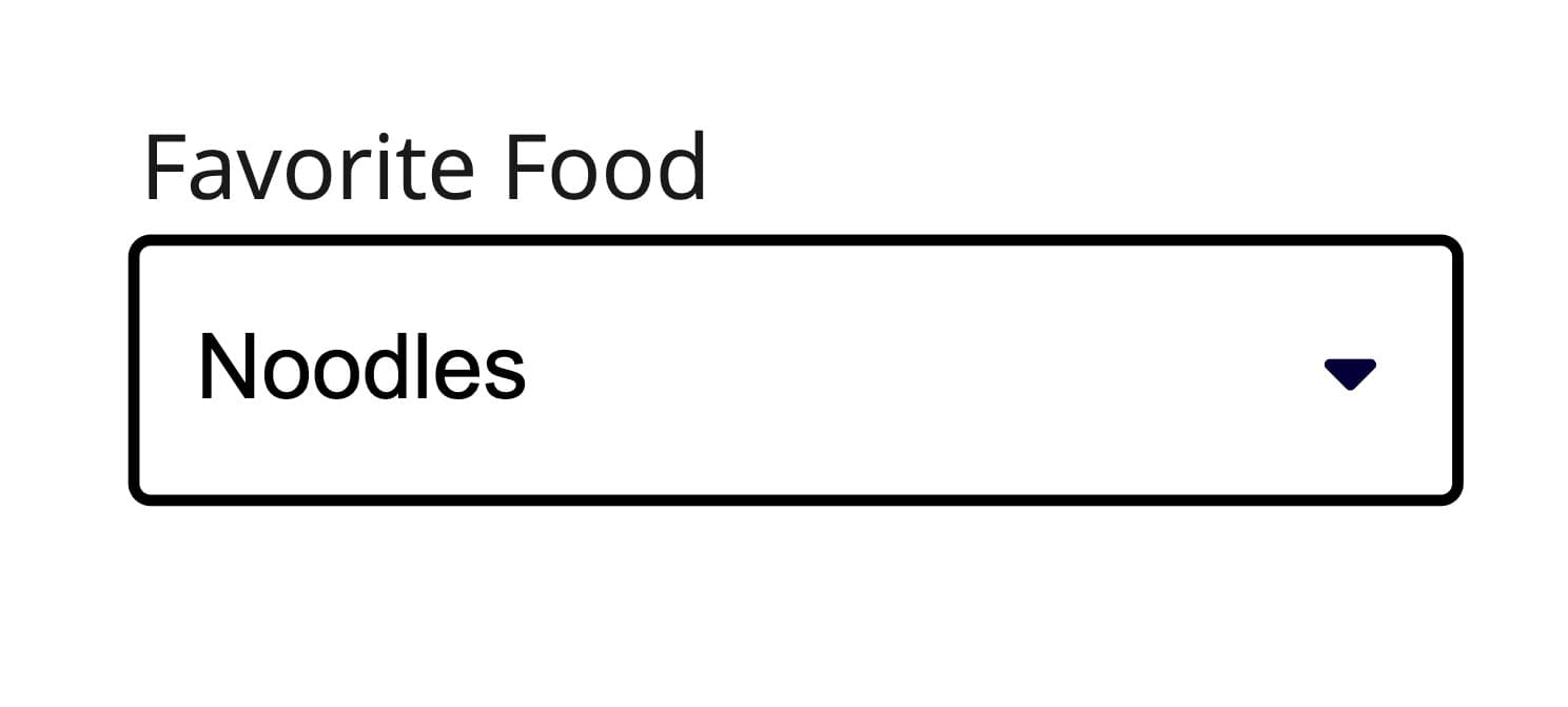
Use a clear and concise text label to clarify the meaning.
Don't
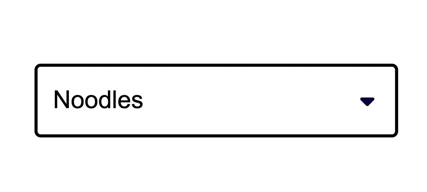
Avoid using the Autocomplete without a label unless the Autocomplete is part of a complex scenario and its context is already set.
Item content
Consider the width of the Autocomplete and keep the names of the options short and compact so that they fit. Long item names that occupy multiple lines are hard to perceive and should be avoided.
For options that need a primary label and a secondary line, compose with <TextValue> and <Description>. The description is wired to the option's aria-describedby automatically.
Do
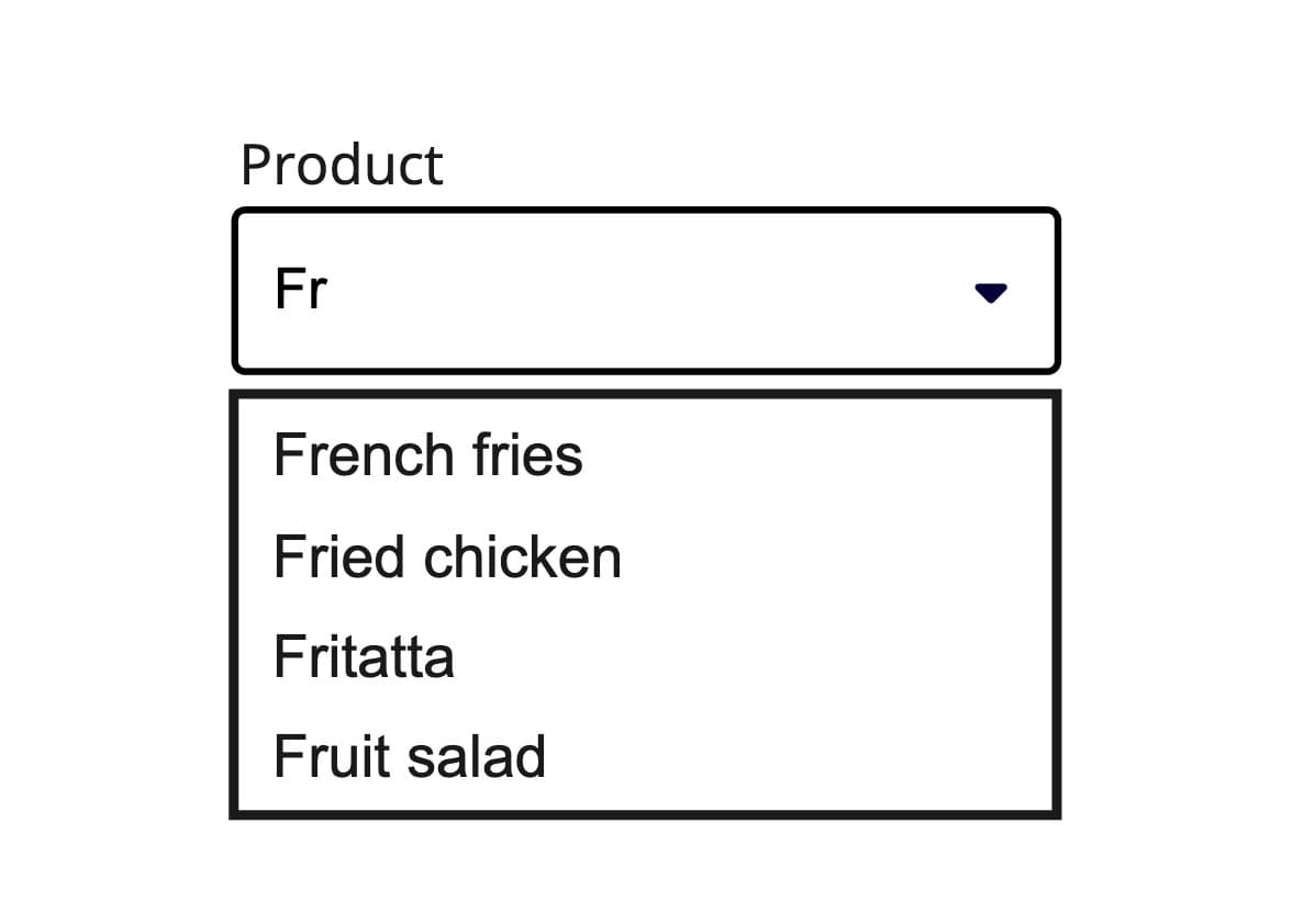
Keep the description of the options as short as possible to improve readability.
Don't
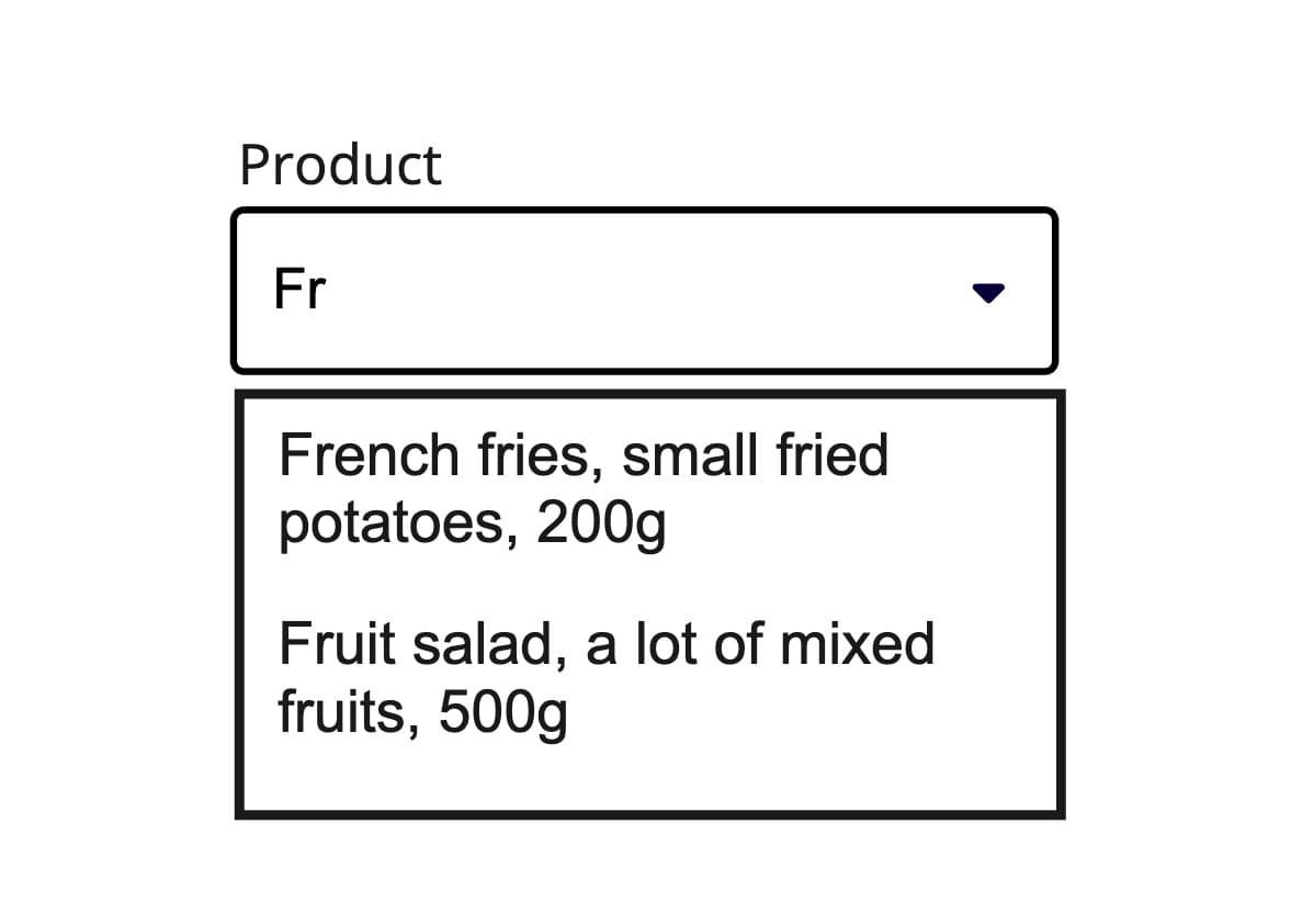
Avoid using lengthy option descriptions because the text can get truncated and users will find it difficult to read.
Async Loading
- Large datasets that would be inefficient to load all at once
- API-backed search where results come from a server
- Dynamic filtering where options change based on input
The useAsyncList hook provides built-in support for async loading, handling request states, cancellation, and filtering automatically. When implementing async loading.
With sections
When related options are present, organizing them into sections enhances clarity and usability. Grouping options provides additional context and helps users navigate choices more easily. This approach reduces complexity and allows for additional guidance when needed, ensuring a more intuitive experience.
This can be achieved by wrapping the options in the <Autocomplete.Section> component. A header is required for each section, which is set using the header prop.
Props
Autocomplete
Prop
Type
Accessibility props (4)
Prop
Type
DOM event handlers (64)
Prop
Type
Autocomplete.Option
Prop
Type
Accessibility props (1)
Prop
Type
DOM event handlers (63)
Prop
Type
Autocomplete.Section
Prop
Type
Accessibility props (1)
Prop
Type
DOM event handlers (64)
Prop
Type
Alternative components
Combobox: A text field that allows the user to select values from a provided items array. Useful when there are mote than 15 options.
Radio: Component which allows to select only one option from a list. Use it if you have less than 5 options.
Select: A component with which you can choose exactly one option from a list with predefined options.